
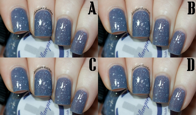
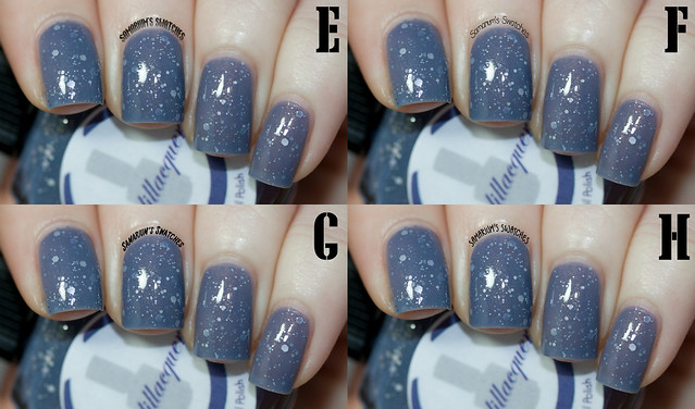
I realize now that I made these all way too small, but you can click though Flickr to maximize!
Please help! Leave your response below or in the Poll I added on the blog!
Please help! Leave your response below or in the Poll I added on the blog!

D.
ReplyDeleteD
ReplyDeleteC :)
ReplyDeleteA (:
ReplyDeletePersonally I find A-D fairly hard to read, even larger. H and F are the clearest for me.
ReplyDeleteF, it is the best to read at this small size ;).
ReplyDeletei like C!
ReplyDeleteF
ReplyDeleteI vote for E. Looks special, bold and easy to read. :)
ReplyDeleteD
ReplyDeleteF!
ReplyDeleteI'd say F!
ReplyDeleteD and G, haha I can't pick :P
ReplyDeleteI like F, it's so cute yet readable at that size
ReplyDeleteF but they are way to small anyway, but I can read this one good ,
ReplyDeleteI vote D. Its decorative but still easy enough to read.
ReplyDeleteI love B & C :)
ReplyDelete'C' for sure!!!!
ReplyDeleteD - still fairly easy to read at this smaller size = win
ReplyDeleteD!
ReplyDeleteI really like E, because it keeps with the 8-bit theme of your blog!
ReplyDeleteD is my favorite of the "script" fonts, as well... but I wouldn't actually pick that one unless you have a blog theme overhaul coming up. Which I hope you don't, because your pixel-polish background is awesome!
My vote goes to E! And I'm pregnant, so right now that totally counts as two votes! ;P
Congrats!! And ty! The pixel fonts I have won't curve that's why I lean towards E the most!
DeleteThanks, and you're welcome! I can totally understand that problem with fonts... I think E works well, though. Maybe just plan to up the font size a bit for your regular watermarking if you go for that one, as alexskyline below me stated you don't want people guessing letters. =)
DeleteRule of thumb of watermarking is readable above all, so any decorative fonts will work worst, while clear and simple ones (F&H) will work best. You don't want "blog outsiders" to guess what letter it is! In addition, I don't think rounded handwriting-like fonts will suit your pretty techno theme very well. :)
ReplyDeleteMost the pixel ones won't curve :(
DeleteThis comment has been removed by the author.
ReplyDeleteI like D the best
ReplyDeleteI vote D or F!
ReplyDeleteI like F the best
ReplyDeleteI like F.
ReplyDeleteIt's cool and easily readable
B and H were my picks
ReplyDeleteI like F & D, they were both fairly easy to read.
ReplyDeleteA or F :)
ReplyDeleteI like D or F, they're both pretty, legible, and don't look like a nail 'stache. :P
ReplyDelete